North Vancouver District Public Library
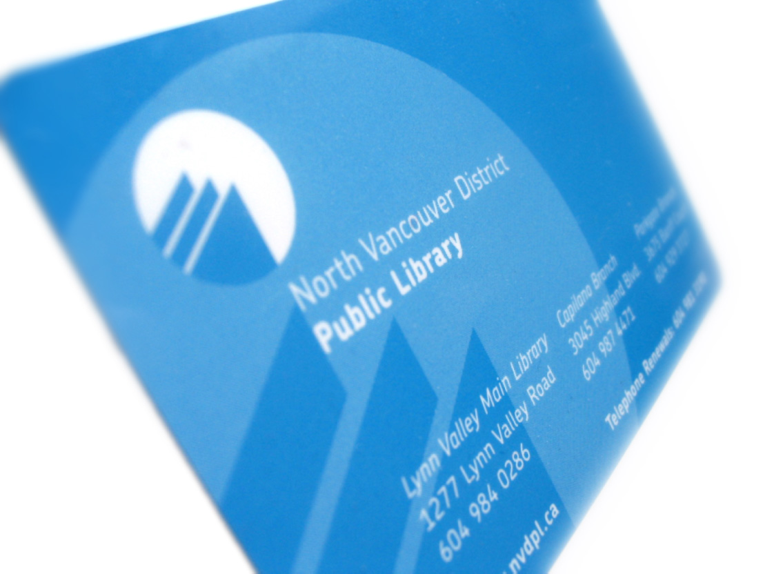
To coincide with the opening of the spectacular new Lynn Valley main branch building, the North Vancouver District Public Library sought to re-brand itself to better reflect its many developments and advancements. The new identity conveys an image of sophistication and diversity and the many services the library provides.
The key component of the identity is the circular logo with three book-shaped panels intersecting the shape from the lower left. A stylized representation of a line of books, they can also be interpreted as a line of monitors, or CDs or video tapes, reinforcing the idea that the library gives access to organized information systems: not only books, but also videos, music, and via the internet, the world. The 3 shapes also remind viewers of the fact that the library is a system of 3 inter-connected branches situated across the entire North Vancouver District, which itself is framed by the 3 north shore mountains. The circle shape also conveys the idea that NVPDL is a cornerstone or a hub in each of its communities.
Emdoubleyu created graphic standards guidelines, collaterol materials for the launch of the new branch and is currently working on the new website which has just finished the first phase of public feedback on two design/architecture concepts.