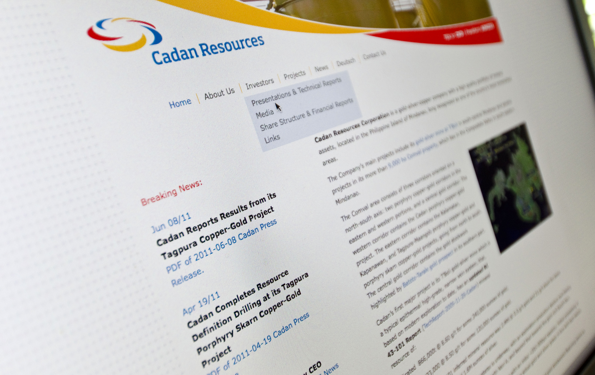
Cadan Resources
Cadan Resources Corporation is a gold-silver-copper company with a high quality portfolio of mineral assets, located in the Philippine Island of Mindanao, long recognised as one of the country’s most mineralized areas. With the recent rise in gold prices and worldwide interest in resources, the company was seeking to rebrand itself to signify its new strategic outlook and its managerial restructuring.
Research identified equity in the old logo’s intertwined gold/silver/bronze shapes. These shapes are also featured in promotional materials which illustrate the ring of mineral deposits in the “Pacific Rim of Fire” area the company’s mines are located. So to keep continuity and reflect growth, they were preserved as part of the evolution that transformed into the new and relevant solution.
The identity focuses on those particular elements by isolating them and adding dynamism/movement to them. The typography features a modern and readable font that projects a “technical” feel but is classic enough in form to reflect integrity over the long term. The new colour palette reflects the blue/gold/red of the Philippines flag and is meant to instill a feeling of nationalism for employees of the company as well as appeal to international investors.
The new identity builds on Cadan Resources’ past, but looks to its future with a modern, contemporary and global identity that reflects its credibility as a reliable, lasting investment, positioned to be a heavyweight among competitors.