International & National Kudos
Vancouver graphic design/branding firm, Emdoubleyu Design has recently been honoured with four prestigious awards for creating marketing materials that position clients with a leading edge.
A prestigious IABC Gold Quill (International) Excellence Award in business communication category for its design of the BCAA 2006/07 Corporate Report/Calendar. Matt Warburton, principal of Emdoubleyu says, “The BCAA corporate calendar lists the goals for the various corporate sectors, and compares the past year’s achievements to future goals. The corporate section links with the monthly calendar section to help illustrate those goals,” he says. “We used the idea of hitchhiking across BC as the thematic device for the portraits. Each person wrote out their own sign and with the help of an encouraging photographer, Perry Zavitz, they managed to get quite animated to help illustrate their stated goals or achievements. Produced in partnership with Forwords Communication, the theme resonated well with staff and significantly galvanized the organization.
Two GDC Graphex National Design Awards: Garagiste series of wine labels and business cards for Dr. Andrew Mason. The labels reflect the craftsmanship of wine production by small-scale garage vintners through beautiful photography of worn tools (unlikely symbols of good wine) by Bonny Makarewicz, and crisp fluid typography, fitting of the wine.
The other Graphex Award was for an entirely out-of-the-box business card for Dr. Andrew Mason, a specialist in MRI scans. Dr. Mason is a leader in his field and runs the radiology (scanning) department at Ridge Meadows Hospital in Maple Ridge. In explaining the novel rationale Warburton says, “Andrew has a very dry sense of humour and some of the more ‘interesting’ patients sparked the idea for his stationery in which obviously foreign artifacts are found in body scans, so the tagline “I think I see the problem…” was inspired by his comments after reviewing a scan.
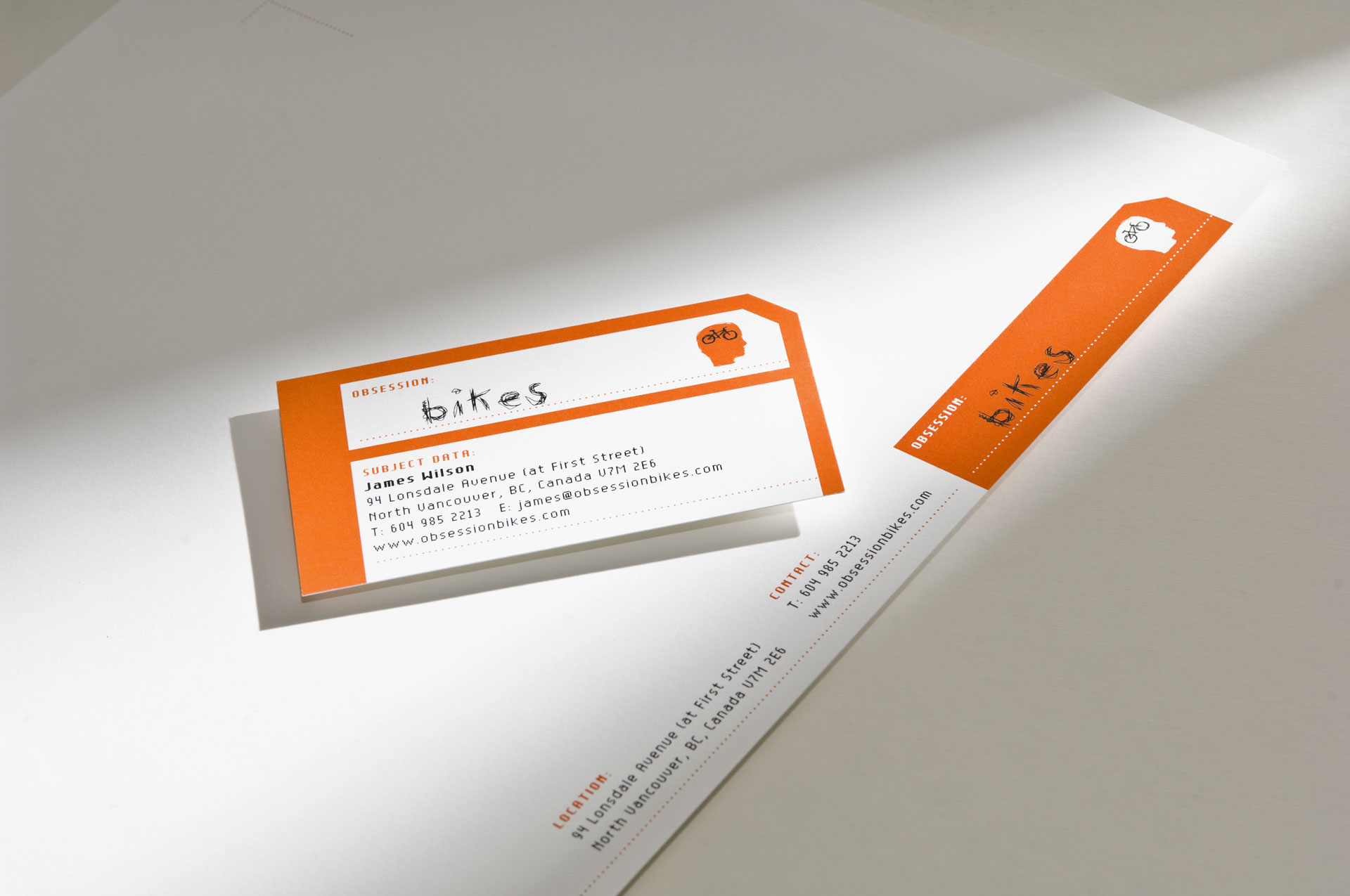
The Applied Arts Award from Canada’s Visual Communications magazine was a coup because again, Emdoubleyu was evaluated among international entries. This winner was for an outstanding branding system for retailer, Obsession: Bikes. The client is in a league apart from its competitors by resonating with its customers through a succinct image and powerful use of an strong, simple concept for the shop’s logo and equally clever ads, all vital elements in a strong branding strategy.
“This recent string of awards confirms that knowing the client is the key to delivering powerful, effective design solutions,” says Warburton. “We always look at the client’s core message. If it needs refining, we help them distill it and turn the crucial information into something compelling. Certainly having the technical skills and understanding of typography has been invaluable,” he says.
For more information contact:
Lynn Warburton at
Emdoubleyu Design
lynn@emdoubleyu.com
604.224.3124
- 30 -